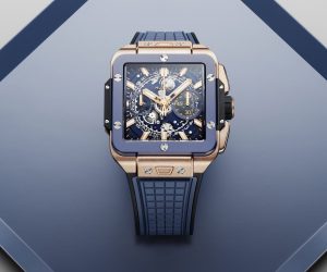
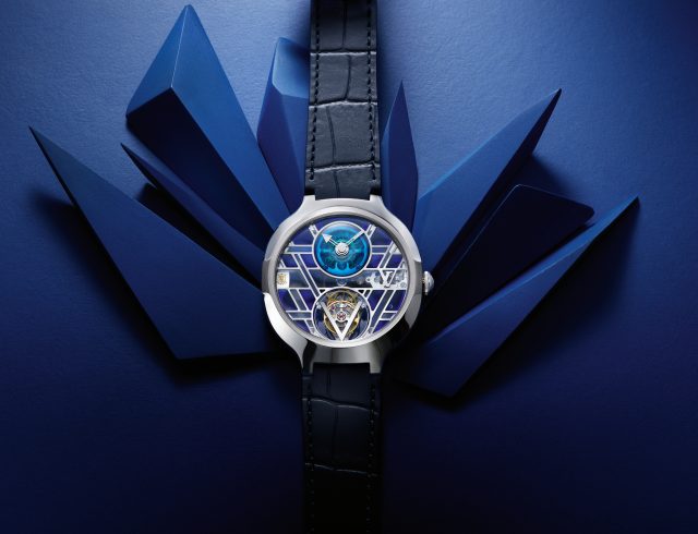
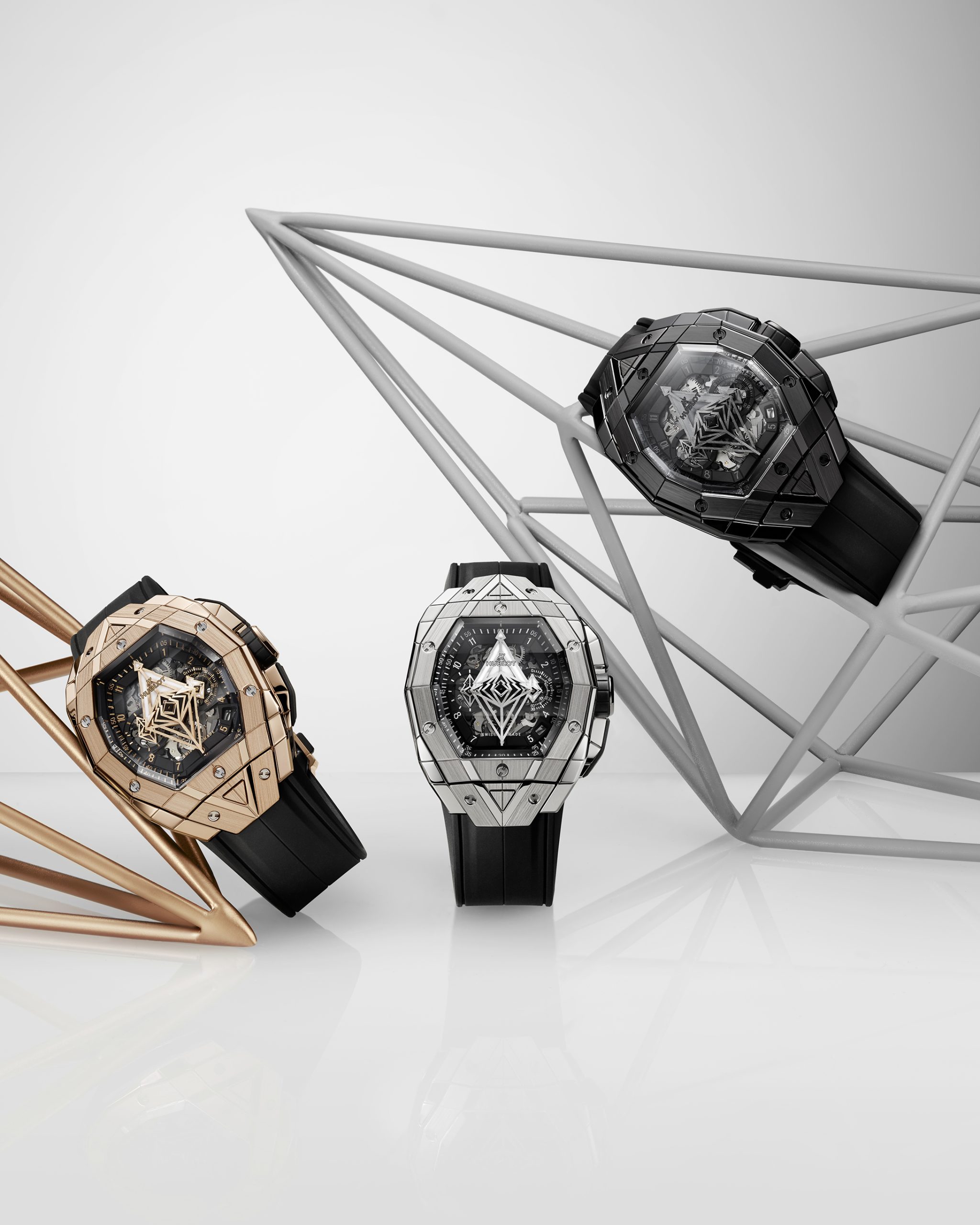
A common thread connects the world’s great designs, from architecture to cars, furniture to sneakers; the most iconic ones began from a single line sketch stemming from imagination and creativity. When it comes to watches, Hublot’s collaboration with Sang Bleu is the very embodiment of lines and is even more so with the newest Hublot Spirit of Big Bang Sang Bleu.
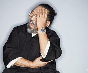
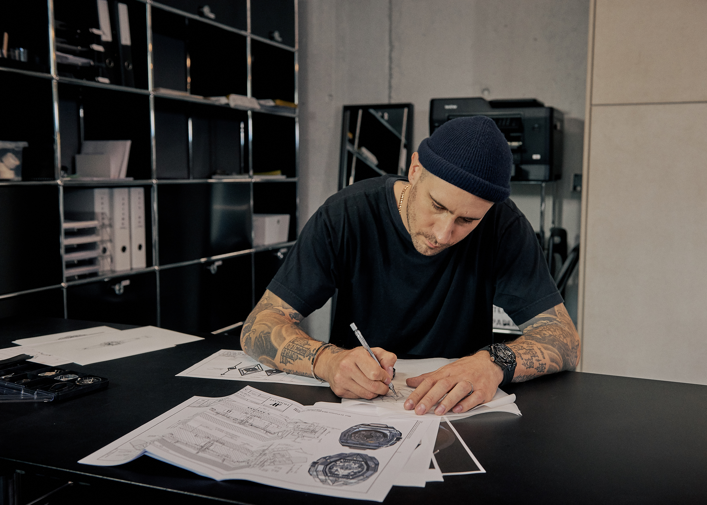
For renowned Swiss tattooist Maxime Plescia-Büchi, founder and creative director of tattoo studio and creative agency Sang Bleu, the humble line forms the cornerstone of his famed tattoo works, twisting and weaving to form new shapes and perspectives. While the human skin is the default canvas for tattoos, Maxime’s creative exponent gets inked in inorganic materials with Hublot. Working with a tattooist might deter even the most avant-garde of watch brands, but for Hublot, it was a marriage made in heaven thanks to the manufacture’s The Art of Fusion philosophy and Hublot Loves Art artistic network.
 We had the privilege to speak with Maxime in Milan for the launch of the Hublot Spirit of Big Bang Sang Bleu.
Could you share a little about your design inspiration for this edition?
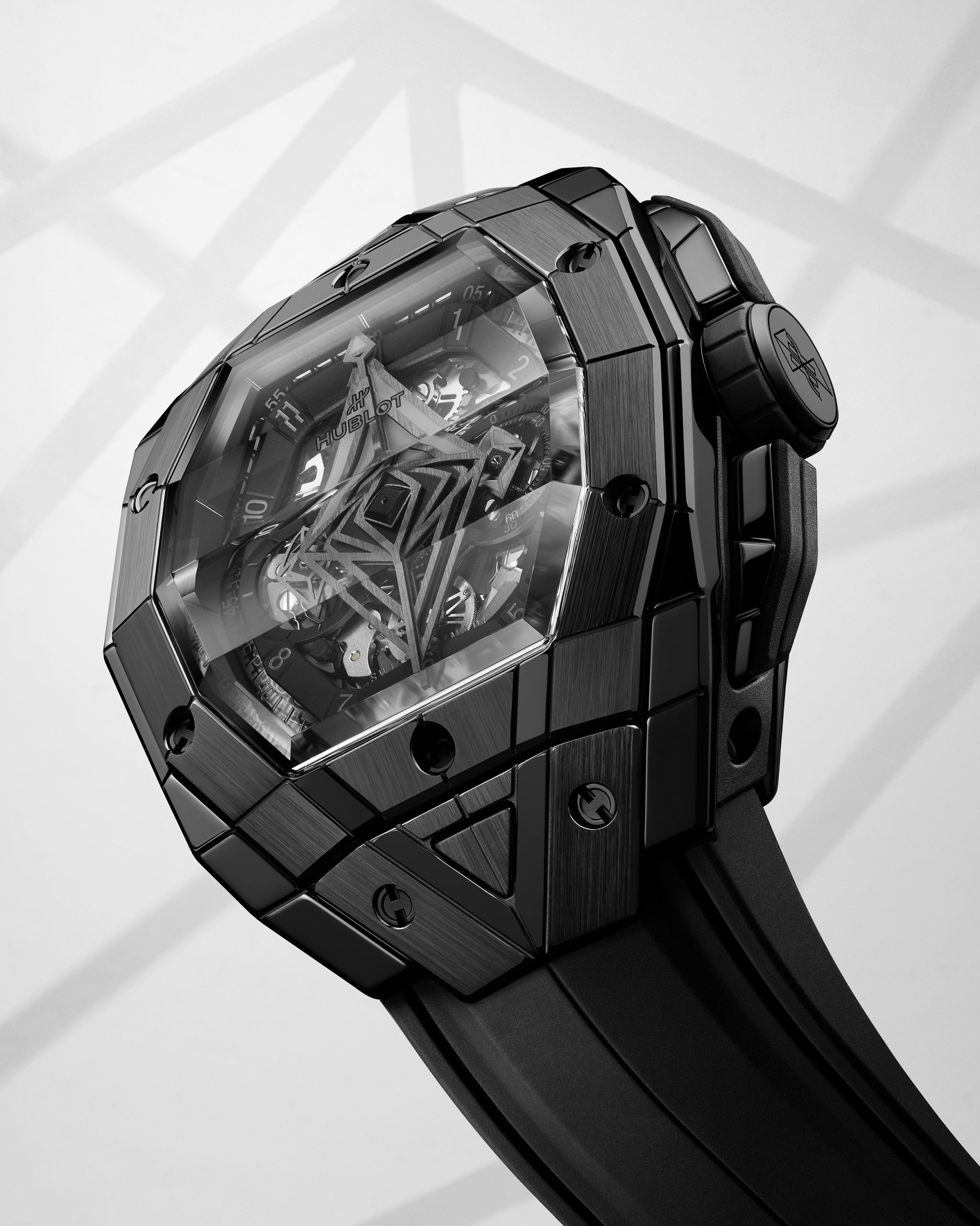
The inspiration itself is the same, and not something we started from scratch. It’s an ongoing process, and each watch is like a snapshot of a moment, a progression in the reflection. If you take the first, second and third [editions], you see the first design sitting on top before progressively spreading inside deeper and taking over the object while appropriating each aspect of the watch.
Take each iteration of the watch — the first, second and third, and compare the amount we changed with the original [Hublot] Big Bang and Spirit of Big Bang. The first is probably 30%, 55% in the second and around 70% of the third is redesigned and reconceptualised based on my design approach. A big and pragmatic part was ensuring we kept Hublot’s big sports watch identity while making it wearable. I like watches that either feel part of you that you don’t notice wearing or feel good that you enjoy touching.
 So it has to be very comfortable.
Exactly. I wanted the watch to feel like you’re missing something if you don’t put it on in the morning, the feeling you get when you forget to take your bag or wear your glasses.
It’s an essential piece of you, and it’s not even just a wardrobe anymore.
That’s right. It’s not an add-on; I want it to be the extension of the wearer.
Just now, you mentioned how this being the third edition, the through line that came about was that you keep modifying from the previous edition.
I can analyse each piece and identify areas that require adjustment. From there, I tried to push its boundaries. This approach applies not only to the watch case but also to elements like the box. Similarly, though the cases share many similarities when transitioning from the second to third edition, we resolved any unresolved elements and took them to the next level. I believe tonneau watches now have a new relevancy. The rise of smartwatches has brought new relevance to rectangular shapes in general. The rectangular shape has become increasingly common since smartwatches are the gateway to watch ownership today. The rectangular shape is becoming almost a new normal. This shift represents a significant change in watch aesthetics and design. While some brands have embraced the tonneau shape as their signature style, I believe every brand should have this traditional shape. That’s where the most innovation and effort in designing should happen now and in the coming years.
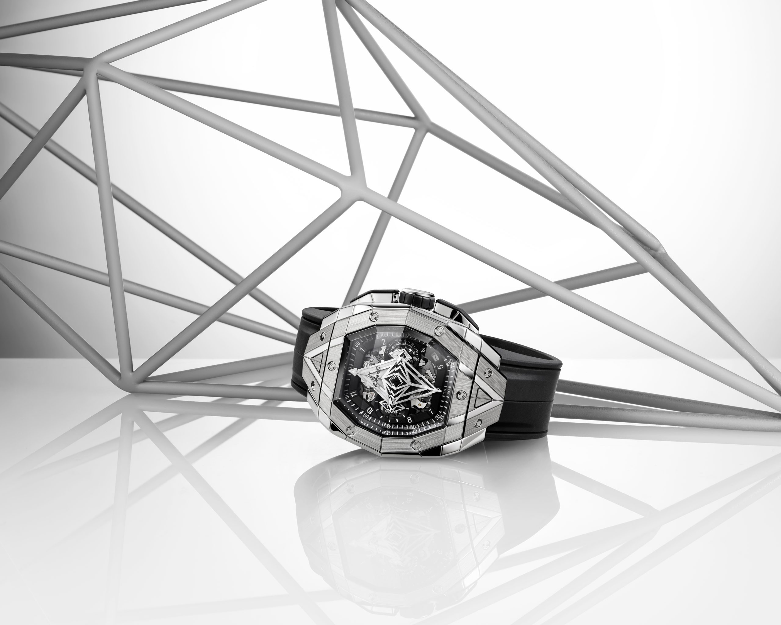
 How do geometric shapes and symbols lend themselves to so much interpretation? Because I am not sure whether it would be true to say that it’s quite a theme in your work.
It’s a theme in my work because it’s a theme in human culture as a whole. Geometry is the visual expression of mathematics, and mathematics represents the abstraction of human perception and interaction with the world. It possesses a universal quality found in every culture, including cave paintings. It’s the same with language, using terms representing a concept and not a given specific reality. Geometry is an abstract language. I think it’s a mistake to think that verbal language is a non-ambiguous expression. It is ambiguous, and it is something that, quid pro quo, it’s the rule more than the exception.
In Western culture, particularly where I grew up, geometry is often associated with science and mathematics. These subjects are often connected to the perceived superiority of the rational mind, acting as a proxy for the Western mind. I find this association hypocritical and incorrect. If you truly look at mathematical and scientific languages, both do not have a distinct “before and after”. It wasn’t invented during the Renaissance or whatever. Even the term Enlightenment is something that is, as much as—
Self-aggrandising?
Yeah, it’s a fake idea that we suddenly had a revelation and detached ourselves from religion in particular. In reality, there is a continuity from Antiquity to the Middle Ages to Renaissance and the modern era. Looking at the notions used in science and programming, they’re culturally conditioned rather than objective or purely natural. Geometry has the ability to project the most forward-thinking scientific perception. Geometry is inherent within us, although many people, at least in the West, are not fully aware of it. The Duomo, for example, is constructed using geometry and shapes that predate the Enlightenment period. For me, geometry serves as a Rorschach test, allowing individuals to perceive what they want to see. Symbols are intentionally avoided except for time-telling purposes. The aim is to create something for people to interpret and find meaning based on their perspectives.
 So it’s timeless and also universal.
Absolutely.
What is your interpretation of Hublot’s motto, “Art of Fusion”, and how does it resonate with you?
For me, it’s the refusal of arbitrary categorisation. It’s quite a literal thing when Hublot starts with noble materials and rubber. But for me, there’s this idea of refusing categories and readymade boundaries.
And so this being your third time collaborating with a series of watches, how has designing watches with Hublot influenced your tattoo and design output?
That’s a good question; I’d have to think about that. What it did is not have a direct influence on tattooing. It’s getting to know, getting used to and learning to build something with a group of people and competencies that others will have that I don’t directly have. The experience working with Hublot taught me how to learn to think with other people’s competencies, which I apply daily when working on any other project.
 So how do you view the relationships between watches, watch design and your design work with Sang Bleu?
I integrate new things into my design system only if they organically augment, create an ecosystem and become part of it. This became a crucial part of my design system. My associate, Emmanuel Rey, managing partner of Swiss Typefaces, would share the same perspective. Although he is not directly involved in the design for Hublot, our approach to design and the way we work reflects this principle. Although what I do might be slightly different from Swiss Typefaces’ in-house designer Océane Torti’s designs, for instance, I cannot say they are any less good. This approach has significantly influenced and shaped everything we do, not necessarily in a literal sense, but in how it has impacted our thinking, work process, and design.