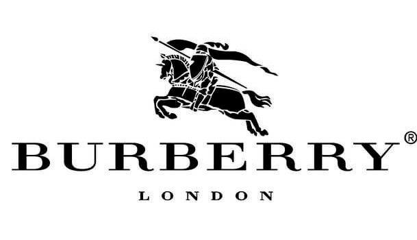
Through the years, we’ve seen Burberry logo like this:
Now that Riccardo Tisci is at the helm of the fashion house, changes are afoot. The newly installed creative director continues to put his mark on the iconic British brand even before putting out a full collection.
Last Friday morning, he gave us a taste of his plan for the brand by unveiling a new logo and monogram via Instagram, updating the classic one which has been left untouched for almost two decades.
To herald in a new era beyond the reign of checks and tartans, Tisci teamed up with Peter Saville, English art director/graphic designer who is best known for his work for Factory Records artists – think Joy Division and New Order. He has also worked with fashion elites including Jil Sander, Stella McCartney and recently Raf Simons to redesign Calvin Klein’s logo.
So what’s changed? Burberry’s 1908 Thomas Burberry Monogram has been reimagined in red and honey, and displays the letters “B”and “T” – the initials of the founder. To pay homage to its home city, underneath the refreshed logo is “London England”. The logo is now in a more modern, bold typeface while the signature equestrian knight logo and “Burberry Established 1856” are removed.
Apart from revealing the new designs on the Burberry Instagram, Tisci also showed off the email threads between him and Saville which led to the creation of the new identity of the brand.
All that’s left to do now is wait and see what Tisci has in store for his first Burberry show next month. Perhaps the collection, much like the logo, will serve as both a modern change and a tribute to the past.